A plate of caramel popcorn, cheese popcorn, chocolate-covered popcorn, and fried chicken nuggets on a picnic table with a jar of Piedmont Pennies cheese balls in the center.

Logo / Guidelines / Identity / Signage / Packaging

Piedmont Pennies

The company history of Piedmont Pennies™ showcases the entrepreneurial journey of Becca, who is driven by her passion and the recipe passed down from her grandmother. Initially starting as a small operation in her kitchen in North Carolina, the business has grown far beyond her expectations. This growth led Becca to seek a new logo and identity that would remain connected to its origins while opening up possibilities nationwide.

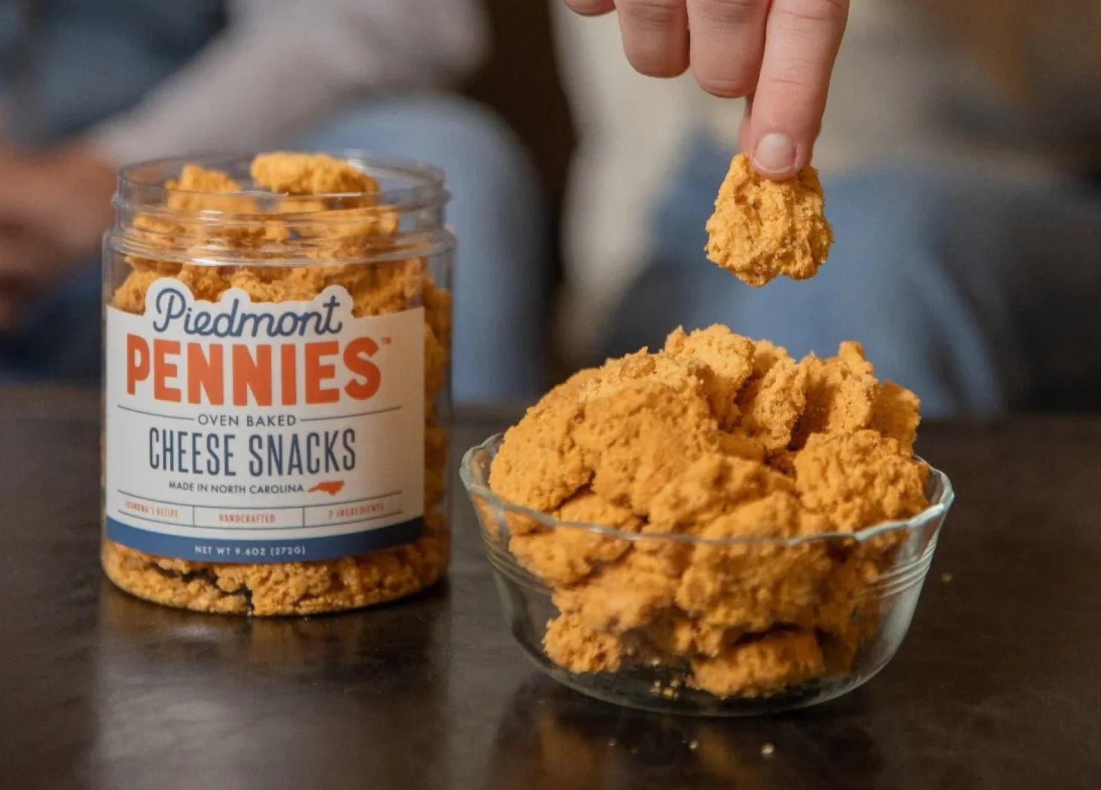
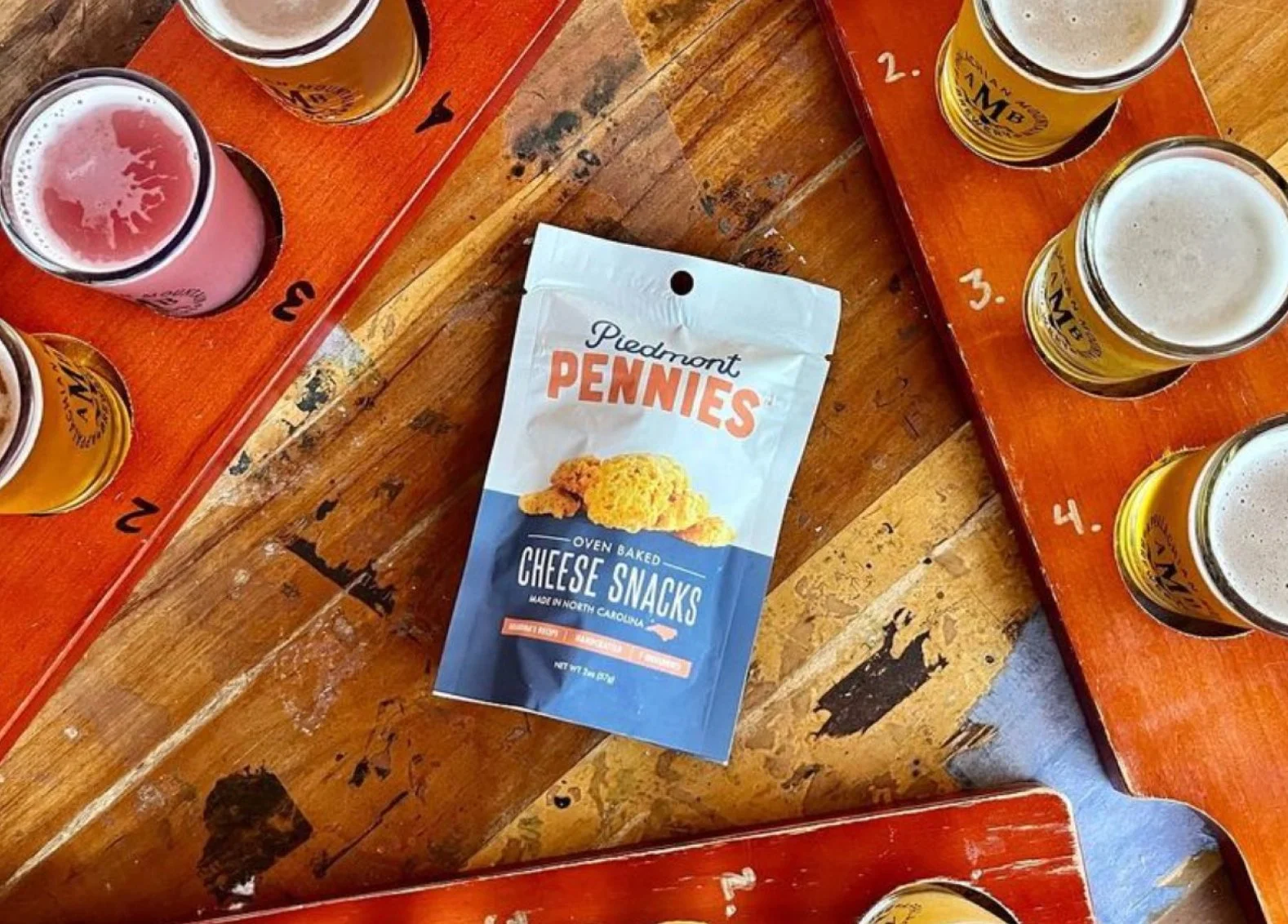
The design process for the new logo and brand identity of Piedmont Pennies™ focused on capturing the essence of the product, which is a cheese cracker, as well as its home state, North Carolina. The color palette plays a significant role in achieving this. Oranges and blues, inspired by the product itself and the state's association, were chosen to represent the brand visually. The combination of these colors creates a visually appealing and powerful logo.

The image features two designs of a logo for Piedmont Pennies, a North Carolina cheese snack. One design has a white background, and the other has a dark blue background. The logo includes the text 'Piedmont Pennies' in a script font, with 'Pennies' emphasized in large, bold, orange letters. Below, it says 'North Carolina's Cheese Snack' in smaller, blue text. At the bottom of each design, there is a stylized outline of the state of North Carolina with a 'P' inside it.
Bag of Piedmont Pennies oven baked cheese snacks surrounded by baked cheese snack pieces.
A color comparison chart showing two palettes: Queen Blue on the left, a dark blue with the words 'Familiarity, Welcoming, Loyalty'; and Mandarin on the right, a warm orange with the words 'Enthusiasm, Optimism, Adventurous'. Each has color codes, RGB values, and hex codes listed.
Person dipping a cheese snack into a bowl of cheese snacks, with a box and jar of Piedmont Pennies cheese snacks on a table.

To further emphasize the origins of the brand, the logo incorporates the outline of the state. This element serves as a visual reminder of the company's roots in North Carolina, adding depth and significance to the design. The typography used in the logo is kept simple and clean, allowing for easy readability and instant recognizability. The choice of a clean, soft script adds a touch of elegance and warmth to the overall design.

In addition to the main logo, supporting marks were created to ensure a cohesive and beautiful identity in any possible scenario. These supporting marks complement the main logo and can be used in different contexts or applications. They contribute to the overall brand recognition and consistency, enhancing the brand's visual identity.

A person is grabbing a cheese cracker from a bowl of cheese crackers labeled 'Piedmont Pennies Cheese Snacks'. The crackers are in a glass jar on a table, with the jar's label visible.
Boxes and jar of Piedmont Pennies cheese snacks with spicy chipotle flavor on a wooden table, candle, and a person holding a wine glass in the background.
Three jars of Piedmont Pennies oven baked cheese snacks, with two jars on a wooden surface and one jar stacked on top. The labels are white with red and blue text, and the contents appear to be crunchy cheese snacks.
A person holding a plastic container of Piedmont Penny Cheddar Cheese Snacks tilted slightly, with the cheese snacks visible through the transparent container against a plain white background.
A box of Piedmont Pennies cheese snacks, a bowl of cheese crackers, a can of soda in a koozie with a blue logo, and a navy blue cap with a white logo of the state of North Carolina with a letter 'P' inside.
A wooden table with a bag of Piedmont Pennies cheese snacks in the center and four flights of beer tastings on red trays surrounding the bag.
Four bags of Piedmont Pennies oven-baked cheese snacks arranged on a white surface with a plain white background.
A person shopping for canned and boxed cheese balls on a store shelf, with several cans labeled "Pennies Cheese Snacks" and boxes marked "Cheese Ball."

Overall, the design process for Piedmont Pennies™ focused on creating a visually appealing and powerful logo that represents the product and its North Carolina origins. The choice of colors, typography, and supporting marks were carefully considered to achieve a cohesive and recognizable brand identity that stays true to its roots while also embracing the potential for nationwide growth.

Done in collaboration with Thompson & Prince.